The Media Diary
4 min read
Last tended to: 11 months ago
Intro
In the realm of digital portfolios and personal online spaces, I’ve found a particular charm in exploring media diaries—those intimate catalogues where individuals curate and comment on the media they consume. It’s a modern twist on the age-old practice of journaling, now expanded to encompass the vast array of digital content we absorb daily. This exploration inspired me to don my product designer hat and embark on a creative venture.
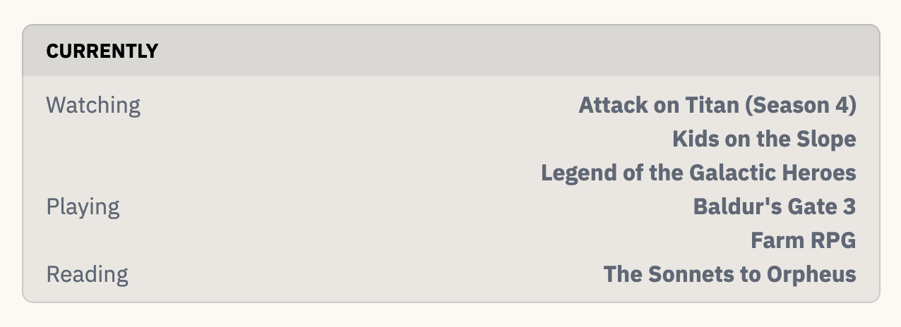
During my digital expedition, I encountered James Duke’s site at arcana.computer, which impressed me with its minimalistic onset and detailed categorization of media elsewhere:
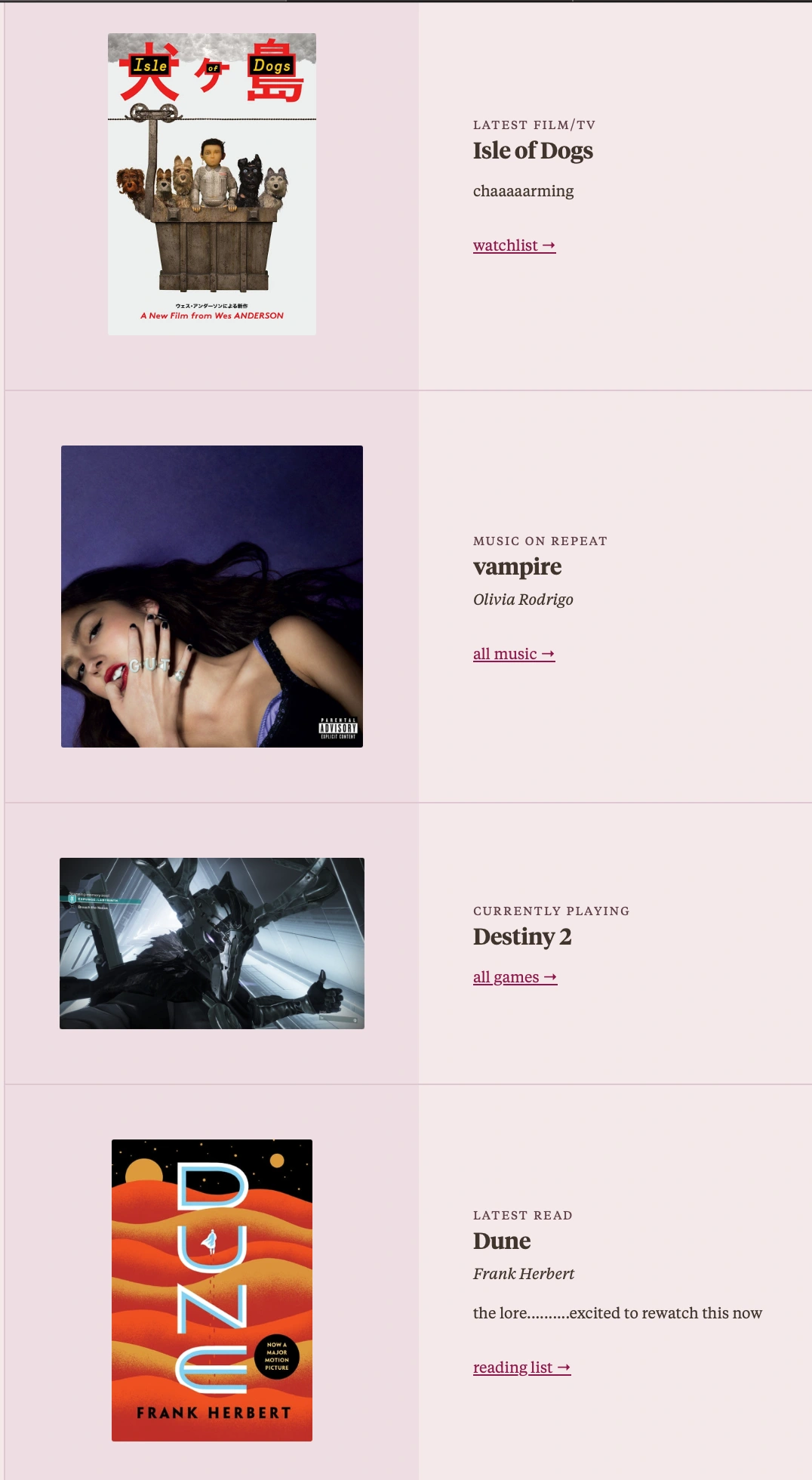
Anh’s vibrant and image-dense site showcased a playful design with heavy image loads that might become a challenge, so I am curious as to how she will approach it:
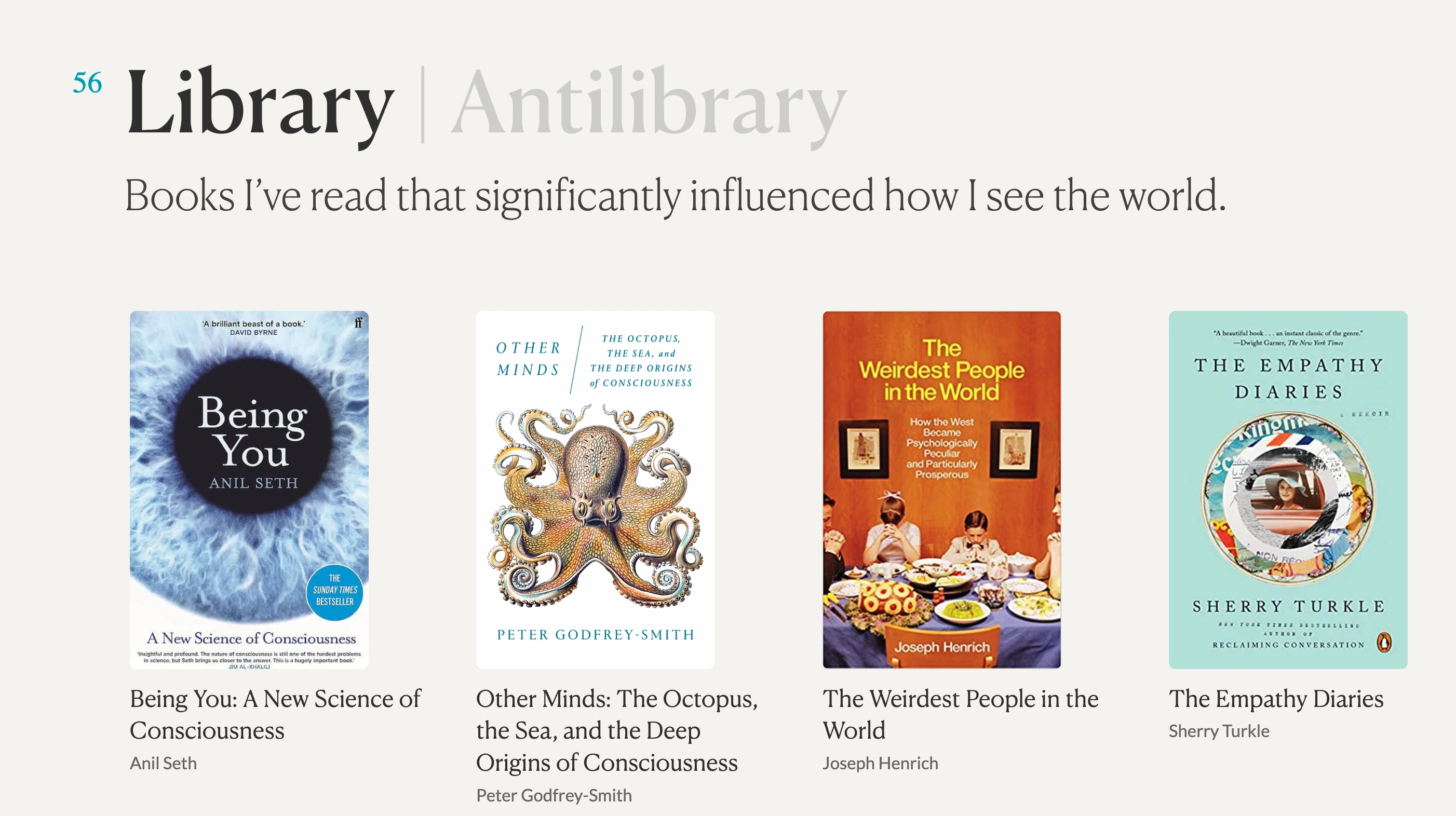
And then there was Maggie Appleton’s library, an eloquently book-focused approach that offered another perspective:
Fueled by these discoveries, I launched Sketch—yes, I’m still holding off on learning Figma—and drafted a blueprint for my media diary. It culminated in a visually appealing layout, complete with annotations for user guidance.
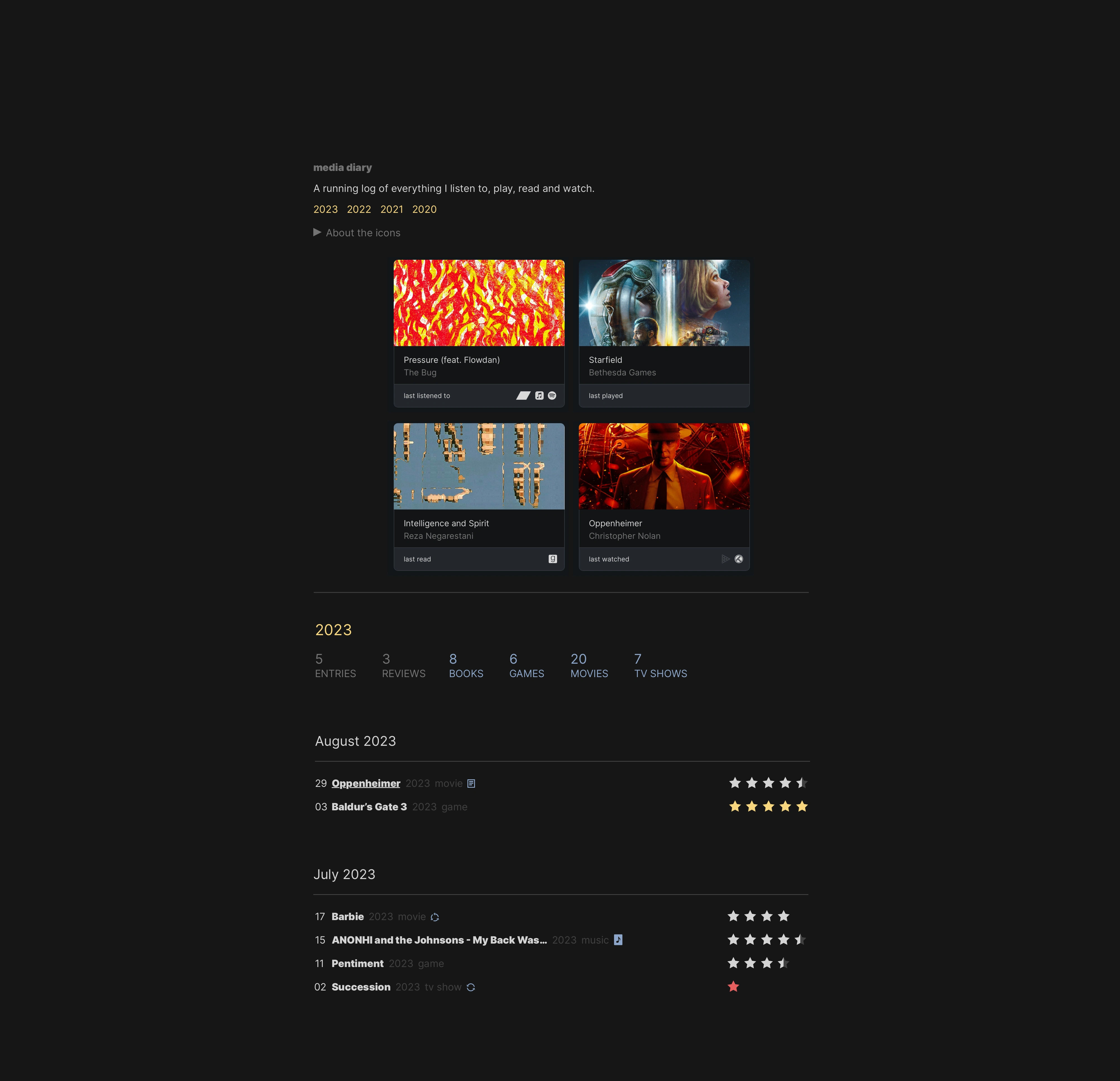
And the annotated version:

Transitioning from design to development, I rolled up my sleeves and got to work in VS Code, where I faced several challenges and learning opportunities.
General Development
- My first task was to manage data retrieval. Astro operates asynchronously, meaning it doesn’t wait around for data to load before moving on to the next task. This required a careful balance of await and async commands to ensure smooth data handling.
- The design of the media cards entailed image cropping, a decision that, that produces mixed results. But….I can live with that.
- To address the occasional sluggishness of API responses, I opted for server-side rendering (SSR) for the entire site. This approach renders pages on the server before sending them to the browser, leading to faster load times and a smoother user experience.
- I won’t go into the icons at the top of the designs, as they are self-explanatory.
Update - 07 Apr 2024
In Astro 4.0, components can SSR. At some point, I will make the changes so that the Music card will update on refresh…so you’ll see what I’m currently listened to or what I have last listened to. I suspect there will be a huge performance hit cause of the APIs getting called on the page.
Each type of media—books, games, music, movies, and TV shows—is represented by its own custom Astro component:
Media Cards
1. Music Card
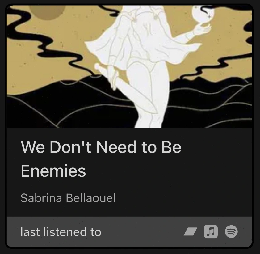
The Music Card displays the most recently scrobbled song from Last.fm—a service I’ve utilized since 2008. Icon links for Bandcamp, Spotify, and Apple Music are programmed to automatically search for the corresponding artist and song on their platforms.
2. Game Card
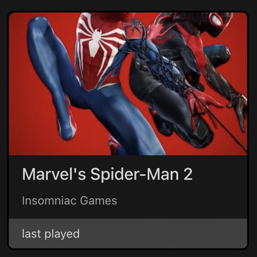
For video games, the Game Card extracted details such as the title, developer, and box art from Giant Bomb’s API. This process requires manual input, which, while not ideal, is manageable.
3. Book Card
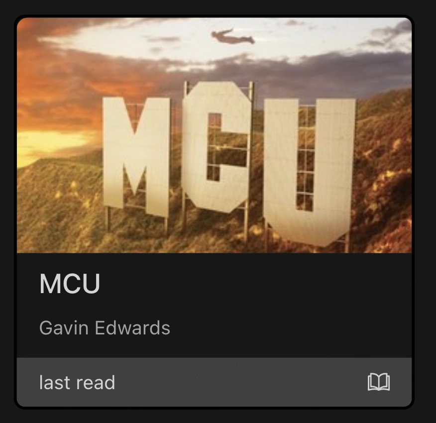
The Book Card was originally intended to feature Goodreads integration, but their API was no longer accessible. I then considered The Storygraph, a fantastic service but lacking an API. Reluctantly, I turned to the OpenLibrary API, which, while functional, necessitated the cumbersome manual entry of ISBNs. A small icon provided a direct link to the book’s OpenLibrary page as a stopgap until a better solution is found.
Both the book cover and author name(s) are pulled in.
4. Movie / TV Show Card
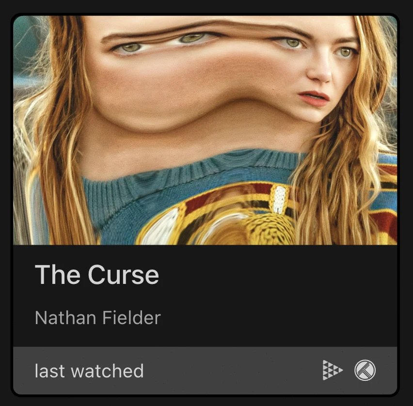
Lastly, the Movie/TV Show Card pulls in the penultimate watched item from Trakt to circumvent a quirk that omitted the director’s name when fetching the most recent viewing. TMDB supplies the images, and platform icons facilitate searches on JustWatch and Trakt for streaming or purchasing options.
Diary Entries
The bottom section of the site is housed in a JSON file brimming with entries — a solution that might prove unwieldy as the diary grows, but one for future me to handle.
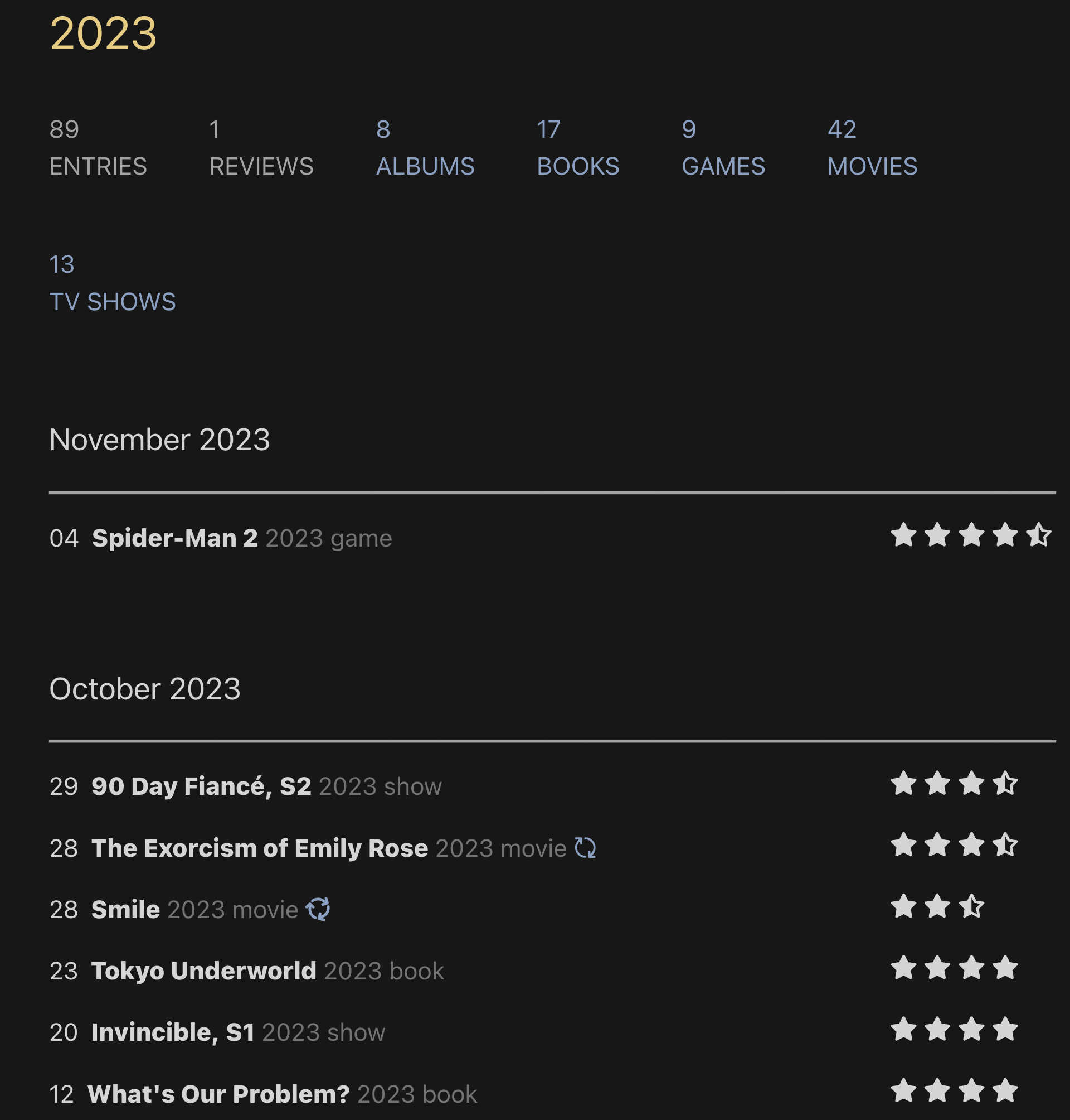
All entries have mandatory fields: day, title, stars, description, and type. The last two are also used for organizational purposes throughout the page. When an entry is rated one star - which means I really disliked it - the star turns a scary shade of red. On the opposite end, if I give it 5 stars, they turn into a pleasant yellow.
Meanwhile, the non-mandatory fields vary and cannot be combined [by design]. Here’s how they’re represented visually:
Plus here’s the lyric pop up in action:
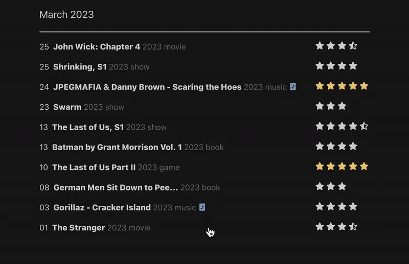
Looking ahead, I’m considering adding concise, four-word reviews as a nod to the lyric quotes, I had a bunch saved, but lost them due to synchronization issues between my devices. I have already live shows to the mix - and I might do more with them, maybe include an icon with a small clip. Who knows?
And that’s where the project stands—a melding of inspiration, design, and development, creating a personal media diary that serves as a testament to the myriad books, games, movies, music and TV shows that shape my experiences.
Enjoy!